
Along with our report, Blocked from the Ballot Box: Structural Obstacles Depress Turnout, Exacerbate Ballot Rejections Across Racial Lines, two interactive maps illustrate voter turnout and ballot rejections in the 2020 and 2024 presidential elections in battleground counties. Our analyses indicate the existence of cumulative inequalities in elections—precincts with lower turnout or also those that are more likely to have higher rejection rates.
In this post, you’ll learn how to explore these maps and what implications our findings have for future elections.
Explore voter turnout and racial demographics in communities
Our analysis finds that turnout in our sample of battleground counties was highest in majority-White precincts in both 2020 and 2024. In the 2020 election, majority-White precincts had an average of about 79 percent registered turnout while majority-Black (about 61 percent) and majority-Hispanic (about 58 percent) had considerably lower registered turnout rates. Evaluating another kind of turnout, average Census Voting Age Population (CVAP) turnout, we find comparable racial inequities. In 2020, majority-White precincts had an average CVAP turnout of about 70 percent while majority-Black and majority-Hispanic precincts had CVAP rates of 60 and 40 percent, respectively.
In 2024, we found a similar pattern—majority-White precincts had an average registered turnout rate of about 75 percent, while majority-Black and majority-Hispanic precincts had average registered turnout rates around 55 and 53 percent, respectively. Majority-White precincts were estimated to have CVAP turnout rates of about 70 percent compared to about 59 percent in majority-Black precincts and 47 percent in majority-Hispanic precincts.
You can take a deeper dive into our data by exploring the first interactive map displaying 2020 and 2024 precinct-level registered voter turnout in 11 counties across seven battleground states.
Using the mapping tool is simple. The map view starts on Wayne County, Michigan but you can move the map to the ten other featured counties by clicking on the bookmark icon at the bottom left of the map and selecting another location from the drop-down menu, or by zooming in and out.
The left side of the slider shows 2020 precinct-level registered voter turnout data, while the right side shows 2024 registered voter turnout. Click on any precinct to see the percentage of registered voters who voted in the respective election, as well as the estimated CVAP turnout and majority race of the precinct according to Census data. Each precinct is color coded from dark blue (0-20 percent of registered voters voted in 2020 or 2024) to dark green (81-100 percent).
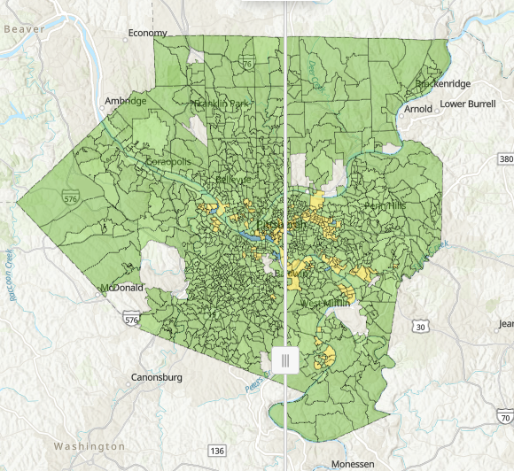
One of the most interesting elements of our map is the ability to explore individual precincts. For example, we can take a closer look at my home county, Allegheny County, Pennsylvania.
[insert image of 2020/2024 Allegheny map here. Caption: Allegheny County, Pennsylvania. 2020 turnout is shown on the left side while 2024 turnout is on the right. Blue shades represent lower turnout, green shades higher turnout, and yellow in between.]
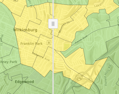
Wilkinsburg borough, in the city of Pittsburgh, has a 20 percent poverty rate and is made up of a mix of lower- and middle-income households, with a median household income of about $47,000. According to 2024 estimates, Wilkinsburg is 47 percent Black and about 38 percent White. If you open the map and click on one of the precincts in Wilkinsburg a pop-up will appear. If I click on the area of Franklin Park, for example, the pop-up for Precinct Wilkinsburg Ward 2, District 5 appears. In 2020, this precinct was majority-Black and had a registered turnout rate of about 55 percent. We can also see many of the surrounding precincts are similarly colored yellow in both 2020 and 2024, indicating turnout rates between 41-60 percent.
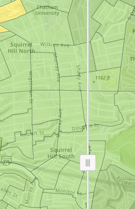
However, if we move the map a little and look to the southwest, we will find Squirrel Hill, where the population is mostly White and high-income, with a median household income of $142,000. By moving the slider side to side, we see that in 2020 and 2024 Squirrel Hill’s precincts had turnouts in the 61-80 percent range. Ward 14, District 3, which has part of Chatham University within its borders, had a registered turnout rate of about 72 percent in 2020 and 67 percent in 2024.
Such disparities between precincts of different racial demographics result in significant under-representation of communities of color. Consequently, these same communities are less likely to have their interests, needs, and preferences reflected in the decisions made by elected officials, leading to policies that often fail to protect their health, safety, and well-being.
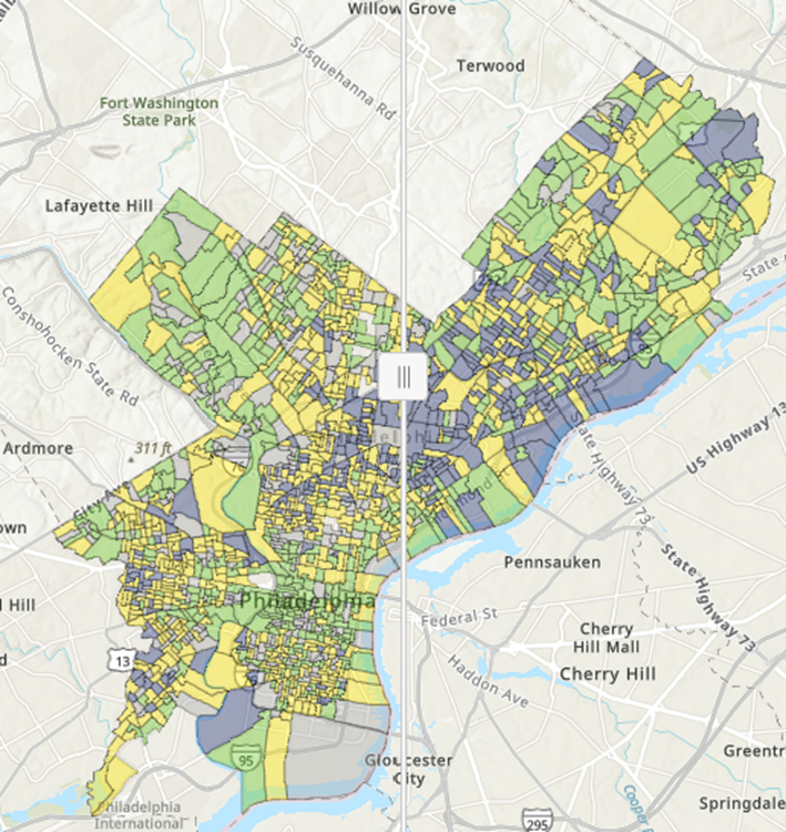
Explore ballot rejection rates and racial demographics
Election administrators face numerous barriers to collect, secure, and share election data. The absence of rejection data for most of our sample counties in 2024 underscores the widespread inaccessibility of comprehensive precinct-level data and the importance of our work to improve election data transparency. (For more, check out this post by guest blogger and report co-author Rose Nafa on election data transparency.)
The second interactive map shows 2020 and 2024 precinct-level ballot rejection rates. In 2020, rejection data are available for 8 of the 11 counties. In 2024, however, we were only able to obtain rejection rates for two counties. As a result, one side of the map will appear blank for counties where data are available for a single year.
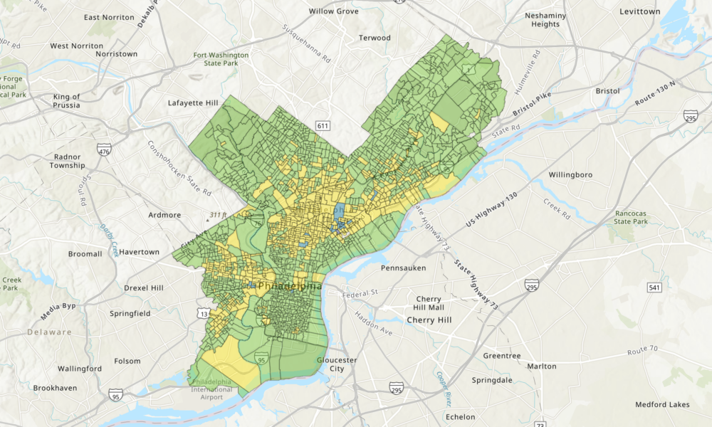
The map view starts on Philadelphia County, Pennsylvania, but you can move the map to the other featured counties by clicking on the bookmark icon at the bottom left of the map and selecting another location from the drop-down menu, or by zooming in and out. In each of the counties where data was available, precincts are divided into thirds based on the percentage of total ballots cast that were rejected. High rejection precincts (those that reject a comparatively higher percentage of ballots than other precincts in the county) are blue, medium rejection precincts are yellow, and low rejection precincts (those that rejected comparatively fewer ballots compared to other precincts in the county) are green. Click on any precinct to see the percentage of absentee and/or provisional ballots rejected, its category of rejection, and estimated CVAP turnout and majority race of the precinct according to Census data.
Ideally, precincts should have low rejection rates, meaning that more voters were able to successfully have their votes counted. However, our analysis found that voters living in low-turnout precincts, which are disproportionately majority-people of color, were more likely to have their provisional or absentee ballots rejected in 2024. These disparities further increase racial inequities in our elections.
Like the turnout map, the rejection map also lets you explore differences between precincts in the same election and also differences between the same precincts across 2020 and 2024. For example, let’s look at a precinct in Philadelphia County, Pennsylvania.
If we click on Philadelphia Ward 07 Precinct 10, seen in the image below, we see that this precinct was majority-Hispanic and rejected 1% of absentee ballots cast in 2020, putting it in the middle third of rejections in the county that election. By moving the slider to the left, we see the same precinct in 2024. Philadelphia Ward 07, Precinct 10 was still majority-Hispanic but rejected 3.90% of absentee and provisional ballots in 2024, putting it in the upper third of rejections in the county that year.
What this means for future elections
President Trump and his allies are already trying to suppress votes and redraw maps ahead of the 2026 midterm elections, which could exacerbate existing inequality. What’s more, such attacks on the voting process are based on misinformation about large-scale irregularities that our analysis shows simply aren’t real. Our precinct-level maps of battleground counties from recent presidential elections rebut the lies that are used to justify vote suppression and demonstrate the real barriers to free and fair elections. They can also help community organizations and election administrators determine where voters in their community need more directed voter education and targeted GOTV efforts.
Now you’re ready to use the map! You can also read the report here or my blog post with a deeper dive into the report results here.